
Questionnaire Module
Amplifying Engagement through a Dynamic Questionnaire Experience
Role: Product designer UX/UI (Solo) - Botson.ai Platform: Mobile
User Research
Concept Development
UX Design
UI Design
A/B Testing
.png)
About the company
Product monetization was the company's goal. It has three vertical products - job search, flights, and e-commerce.
As a designer, It was my responsibility to understand how the company's business goals overlapped with the user's needs.
By thinking creatively, I was able to achieve the company's goals and provide users the best possible experience
The Problem
Our website would display a pop-up when a user landed there,
As the first thing a user sees when they enter our site, we haven't yet earned their trust. In most cases, the user has no intention of entering his details, and the rate of abandonment is high.
The Mission - KPI's
Main Goal
.png)
Increase CTR - get the user engaged on our landing page, as well as get his email and more information about him.
Secondary Goals
Enhancing the site's conversion rate by reducing abandoned users
A unique user will interact with the site as much as possible, and will even return
The Solution - Research
Here is the thinking process I used to arrive at the solution and the research I conducted to validate my theories
Mapping User Journey

Inspiration
As part of my research, I looked at onboarding processes on similar sites as well as in completely different products to learn how they provide a first impression to their users
.png)
“Asking Questions Builds Relationships”
Forbs
The Design
Each questionnaire had the objective of refining the user's search and finding the best option
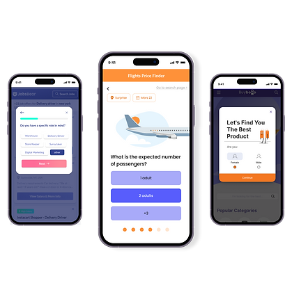
Job search vertical
There are buttons for the answers. The site also has another interface with the same visibility and behavior


Flights vertical
This is a search flow that is designed as questionnaire.
Here, we wanted to test the CTR when visual elements are present


E-Commerce vertical
This questionnaire measures CTR when there are characters that assist the stages.
In addition, we wanted to get information about the users.


AB Testing
As a result, the questionnaire concept proved successful, conversion rates increased and engagement on the site increased when compared to before.
-
The version that displayed the questionnaire increased conversions by 9% compared to the version without the questionnaire.
-
Users who started the e-commerce questionnaire usually reached question 3
-
More than half of the respondents to the flight and job search questionnaires completed them.
The questionnaire concept was used throughout all product development for the different verticals and adjusted accordingly, His performance was usually high
